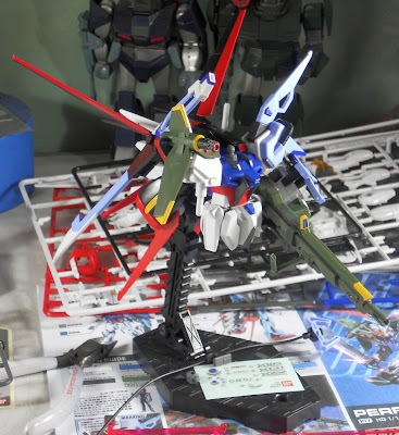
I've been working a bit on the Perfect Strike. Observations:
1) I'll take back the idea that the mounting arm of the Launcher Cannon is less maneuverable than the FG version. It practically has the same range of motion, just a new way of distributing the joints and swivels.
2) The stickers are a pain. They are the best argument for just painting all the details.
3) The gaps between moving parts at the shoulder and the weapon mounts of that backpack are pretty close - proper posing is required.
4) The Sword system's claw shield is now attached using the shield clamp/posts. In the original, the shield was just clipped on to the arm - definitely a nightmare for painters at the time. However, this also means that you can;t use the standard Aile shield and the Sword Shield at the same time (If you really wanted to, though it would make the look more cluttered than it already is....).
5) It may be just my imagination, but I think the old HGGS Strike pieces are showing their age, in terms of sharpness of detail, as compared to the new Perfect parts. It's acceptable - the Strike kit has been around for a long time.
I'll be finishing this snap-build soon, before returning it to the owner (and having it exhibited...).
Update: Click on the following links for the other parts of this multi-part review:
Part 1 - Part 2 - Part 4
Click here for more reviews of other kits.


No comments:
Post a Comment